
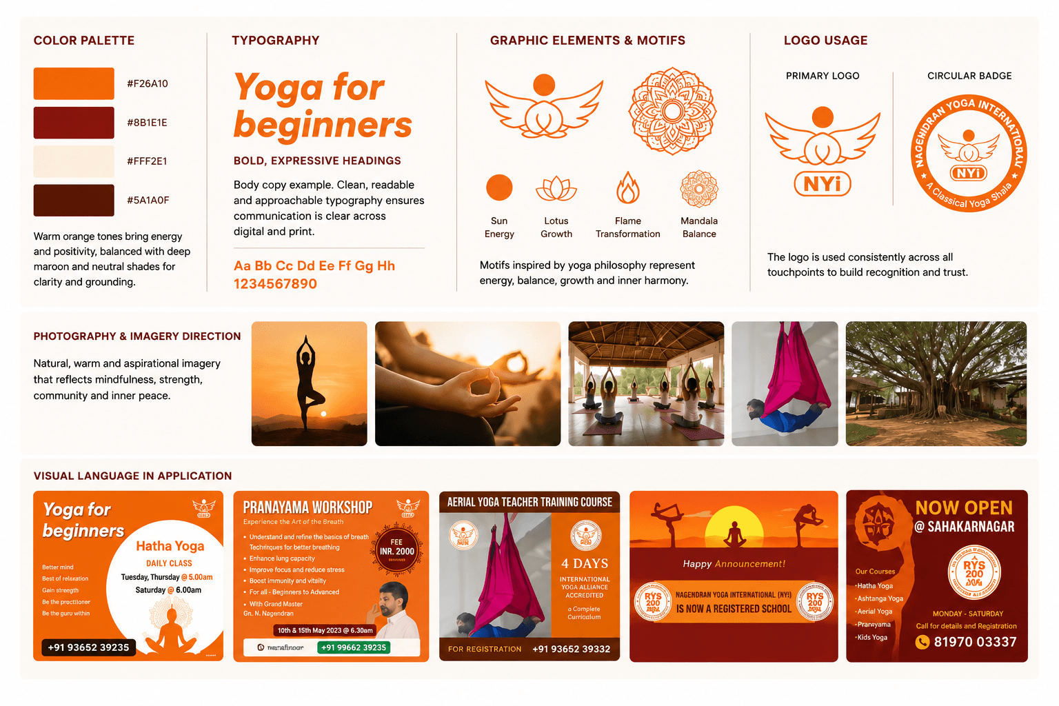
Yoga Center
I designed the visual identity for Nagendran Yoga International and applied the visual direction across promotional, print, and digital touchpoints.
Role: Brand & Visual Design
I designed the website UX/UI and implemented it on Google Sites, then created supporting marketing materials—a menu card and promotional flyer—all sharing a cohesive visual language.
Role
Brand & Digital Experience Designer
Type
Brand & Digital Experience
Project
Sakisa Seafoods
Role
Brand & Digital Experience Designer
Type
Brand & Digital Experience
Status
completed
01 —
The restaurant needed to move beyond traditional approaches to reach customers online. The design work required several things simultaneously:
First, creating a website that presented the menu clearly and made ordering straightforward. Second, establishing consistent visual presence across digital and print—the website, menu card, and promotional materials all needed to feel connected. Third, working within the limitations of the Google Sites platform while still achieving a professional, custom-designed feel.
The challenge wasn't just building a website; it was creating a complete brand experience across multiple formats.
02 —
I implemented the website using Google Sites, which meant working within a templated platform rather than custom development. This introduced real constraints—limited layout flexibility, predefined component options, and less control over responsive behavior than a custom-built site would offer.
Rather than see this as a limitation, I approached it as a design problem to solve. The focus became making intentional decisions about information hierarchy, content organisation, spacing, imagery, and visual consistency. Within the available layout options, I structured the pages to guide visitors clearly from first impression to menu discovery to ordering.
The result was a website that feels designed and considered, despite the platform's constraints. The visual direction and hierarchy were strong enough that the platform boundaries became invisible to the visitor.
03 —
The website needed five main sections: a home page to establish first impression and value; an About section to build trust; a Menu page for detailed offerings; an FAQ for customer questions; and a Contact page for ordering and location information. This structure created a clear path: discover → understand → browse menu → order.
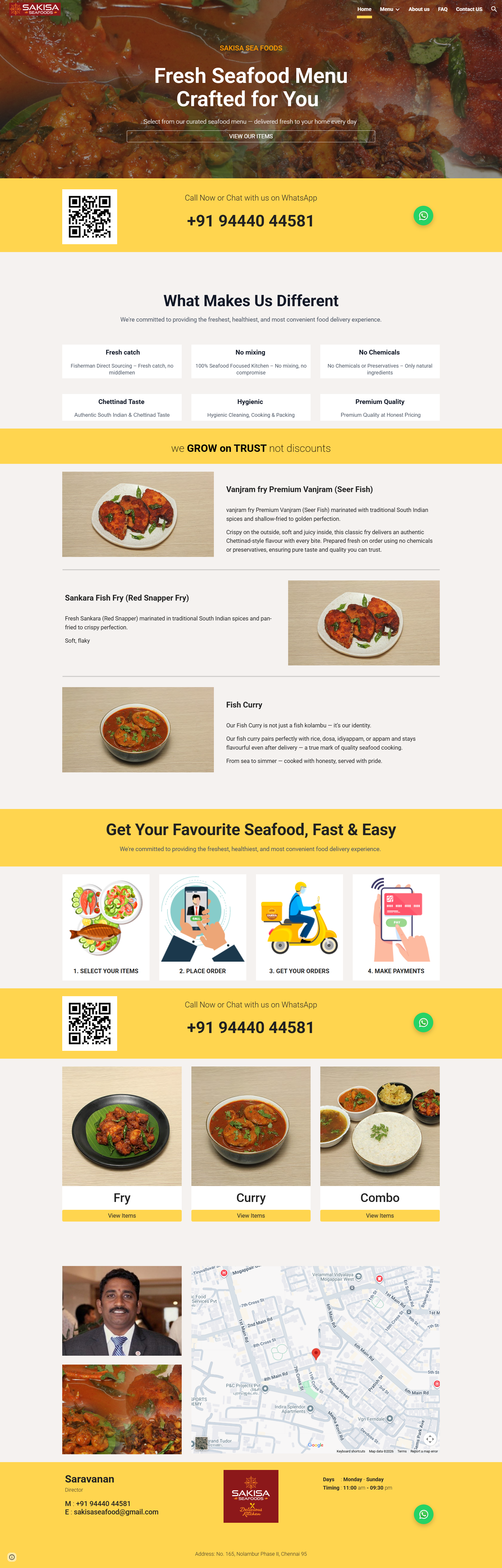
The home page was the strongest part of the design. It opened with a clear tagline—"Fresh Seafood Menu Crafted for You"—followed by six value proposition cards explaining what made the restaurant different: fresh catch, no mixing of stocks, no chemicals, chettinad taste, hygienic preparation, and premium quality at honest pricing. Below that, I structured a menu showcase with food categories (Fry, Curry, Combo), a four-step process flow showing how to order, and owner information with an embedded map. The design guided visitors through a journey: who are you, what do you offer, how do I order, where are you located.
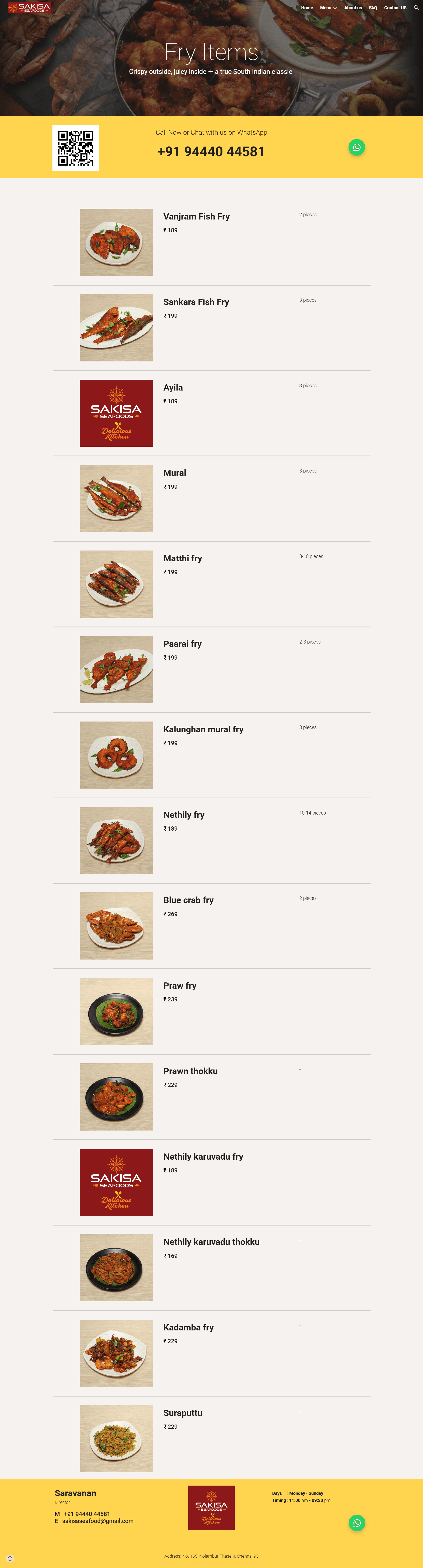
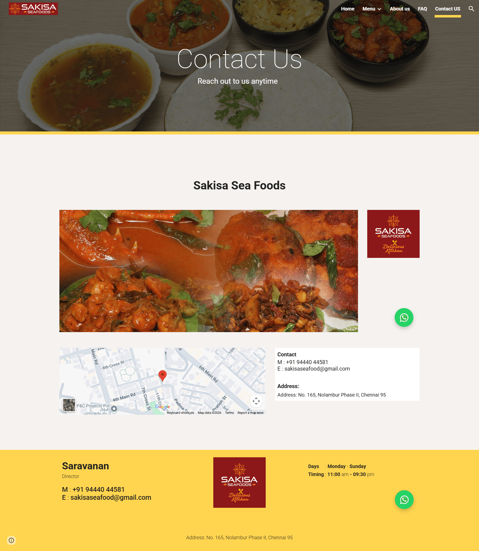
The menu page presented categories and items with descriptions and pricing, organized for easy scanning. Contact and ordering were made prominent throughout: WhatsApp for direct pre-ordering, Zomato for aggregator ordering, QR codes for quick access, and the business phone number repeated at multiple points. The design removed friction from the ordering process.
04 —
Hero section with tagline and value propositions, menu showcase, process flow, and owner information with location.
Organized menu categories with food imagery and clear information hierarchy for browsing.
Multiple ordering options integrated throughout the site: WhatsApp, Zomato, QR codes, and map location.
05 —
The visual direction wasn't something I inherited—the client provided the logo, but the color system, typography, layout approach, and consistency across materials were design decisions I made.
The palette used a deep brown/burgundy primary with golden yellow/orange accents and cream backgrounds. This combination conveyed warmth and trust while supporting appetite appeal for food imagery. The typography was clean and readable across scales, with strong heading hierarchy to guide scanning. The layout used structured sections, clear grouping, and balanced imagery to create visual rhythm.
These choices weren't complicated, but they were intentional. Every element served the goal of presenting the restaurant as professional and trustworthy while feeling approachable. The bilingual presentation—English and Tamil—ensured local relevance.
The strongest part of this visual language was its consistency. The same colors, typography, and layout patterns appeared on the website, menu card, and flyer. That consistency created recognition and professionalism across multiple contexts.
07 —
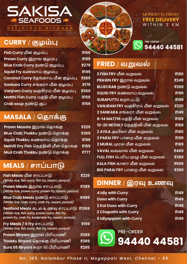
Circular food arrangement anchors the design, with bilingual menu categories organized for easy browsing and clear pricing.
08 —
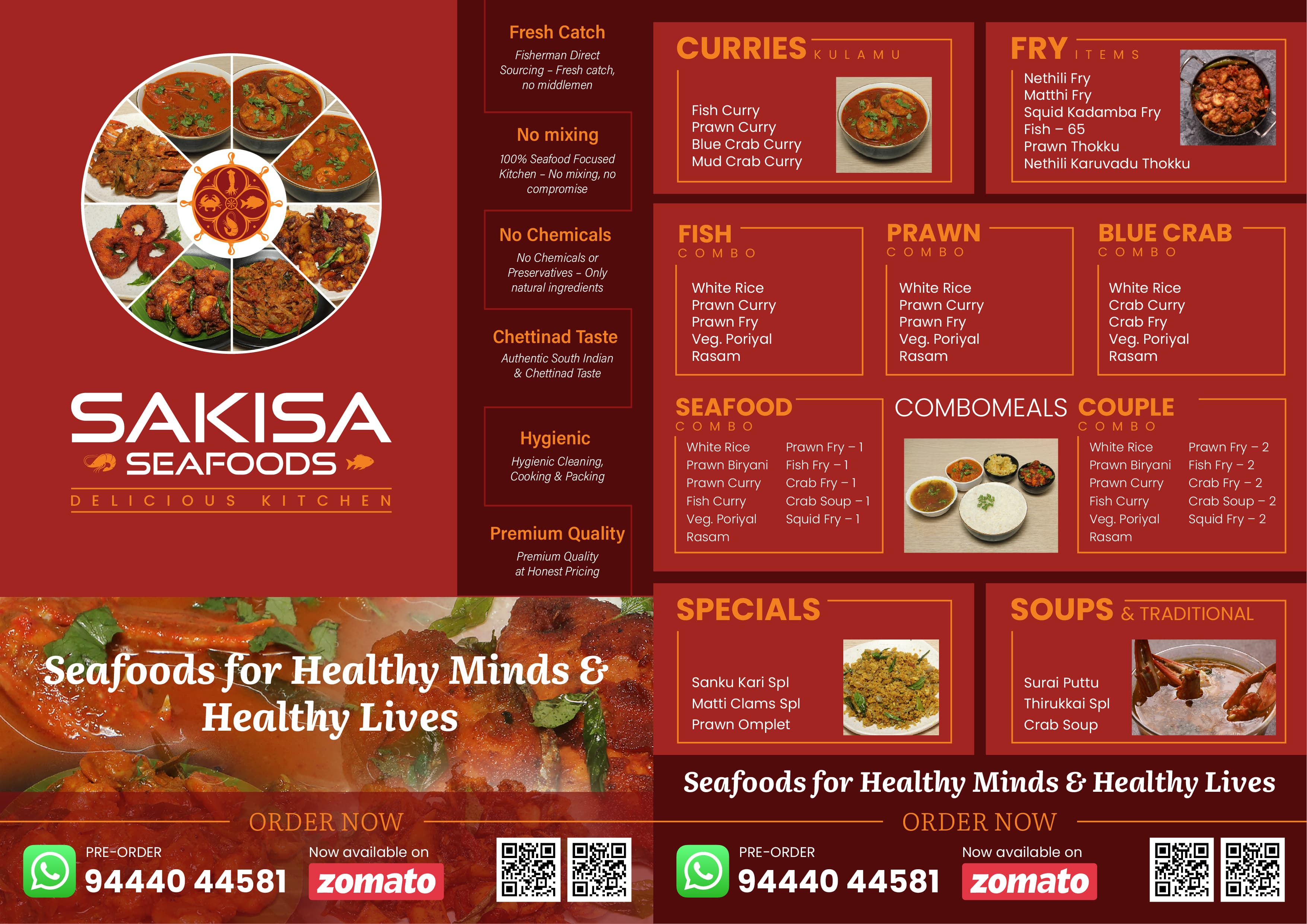
The flyer was a front/back promotional piece designed to catch attention and drive ordering. The front side featured a large circular food arrangement paired with messaging about quality: "Fresh Catch. No Mixing. No Chemicals. Chettinad Taste. Hygienic. Premium Quality." This wasn't marketing fluff—these were actual business practices the owner could stand behind.
The back side organised the menu by category with food imagery and prominent ordering CTAs: WhatsApp, Zomato, and QR codes. The design used the same color system and typography as the website and menu card, creating visual continuity.
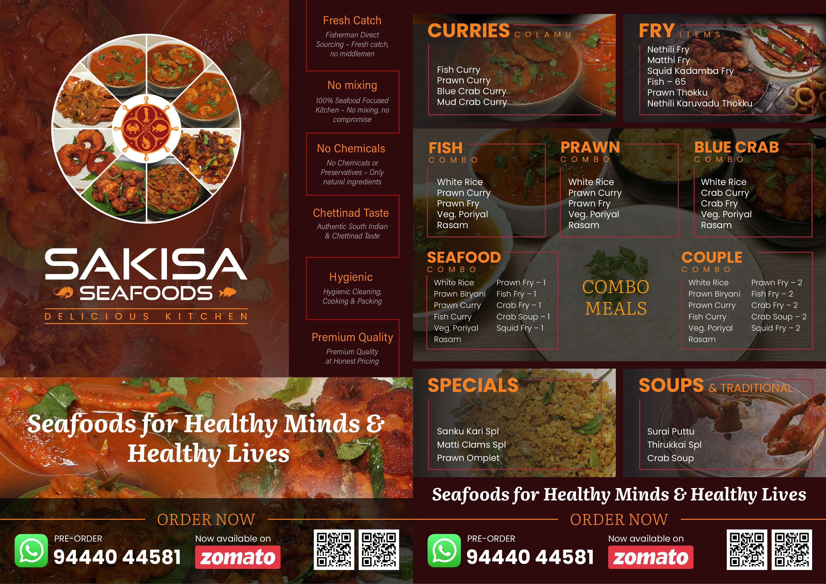
I also created an alternate flyer version, exploring different compositions while maintaining the same visual language and messaging.
The flyer demonstrated how the same visual direction could adapt to different formats and purposes—it wasn't just a miniaturised version of the website, but a separate design that solved the problem of promotional materials while maintaining brand consistency.
09 —
Front and back promotional design featuring value propositions, menu preview, and multiple ordering options.
Alternate flyer design exploring a different visual arrangement while maintaining the same visual language, menu organization, and ordering calls-to-action.
10 —
The strongest part of this project wasn't any single design, but the consistency across all three: website, menu card, flyer.
A visitor encountering the website and later seeing the menu card or flyer would immediately recognise them as part of the same brand. The color palette was identical. The typography was consistent. The way information was organized followed similar patterns. Even the food imagery had a consistent visual treatment and tone.
This wasn't a formal design system with extensive documentation. It was visual consistency achieved through intentional design decisions and careful implementation. Every layout choice, color choice, and typography choice was made with an eye toward maintaining that cohesion.
In practice, this meant that the restaurant's brand voice was consistent regardless of where the customer encountered it—online or in print, on a large desktop screen or a printed card in their hands. That consistency is what creates recognition and trust.
11 —
Digital presence showing visual system in action across sections and interactions.
Print design applying the same visual language to a compact, functional format.
Marketing material adapting the visual direction for promotional impact.
12 —
The website content was created using AI based on business information the client provided—menu item names, descriptions, pricing, address, hours, and business details. I structured that content into the website experience, organising it for clarity and scannability.
This approach allowed the website to launch quickly with accurate business information without requiring me to independently create menu descriptions or business copy. The client remained the authority on what the restaurant offers; I structured that information for the digital format.
13 —
The project delivered:
The design demonstrates the ability to create cohesive brand experiences across different media and formats, to work effectively within platform constraints, and to balance visual design with practical user needs.
No measurable business outcome data was available for this project. The case study is based on the quality and breadth of the design work itself—the information architecture, visual consistency, and thoughtful implementation across web and print.
14 —
This project illustrated how constraints can actually drive better design. Because I was limited by the Google Sites platform, I couldn't rely on custom code or complex interactions. I had to solve problems through clear hierarchy, strong layout decisions, and consistent visual language. The result was cleaner and more focused than it might have been otherwise.
It also demonstrated the value of working across multiple formats. The website, menu card, and flyer were different problems with different requirements, but solving them as a connected system created something stronger than any single piece alone. That kind of thinking—considering how one design choice supports the whole brand experience—is something I bring to every project.
Finally, it reminded me that design at its best solves real problems for real people. Sakisa Seafoods is a functioning business with actual customers, not a fictional case study. The website, menu, and flyer had to work. The visual language had to be professional enough to build trust, but approachable enough to feel welcoming to local customers. Those practical constraints made the design better.
Next Case Study
My personal website is being designed and developed as a practical design-to-code project, bringing together UX strategy, interface design, design systems and frontend development.
I designed the visual identity for Nagendran Yoga International and applied the visual direction across promotional, print, and digital touchpoints.
Role: Brand & Visual Design
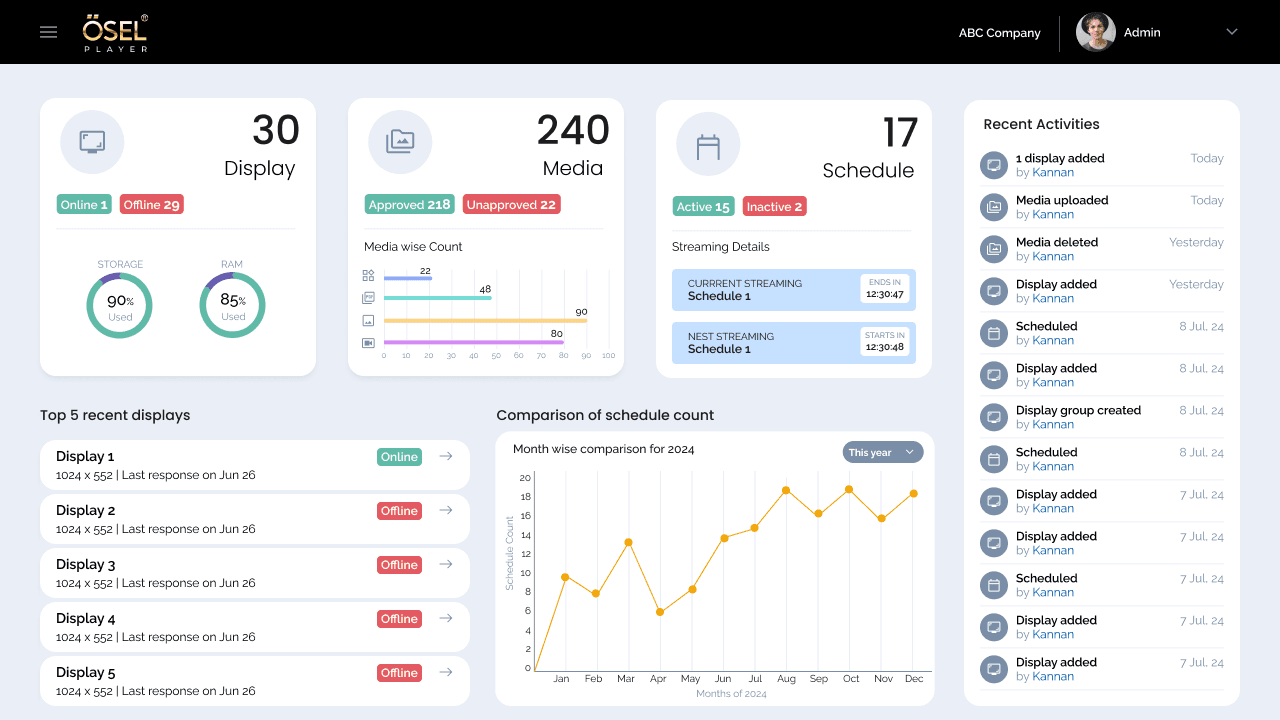
A signage management experience designed to help users create, manage and control digital signage content across displays.
Role: UX/UI Design
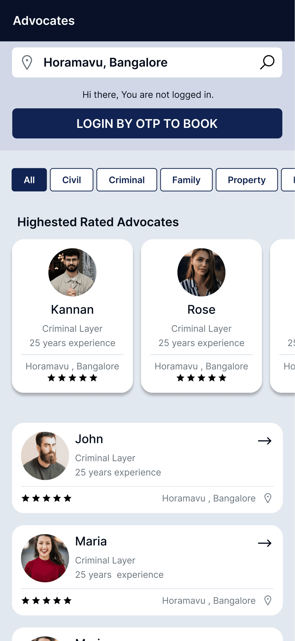
A two-sided consultation platform connecting clients seeking legal advice with available advocates through integrated booking and case management workflows.
Role: UX/UI Design
Let's discuss your project, role or collaboration opportunity.