
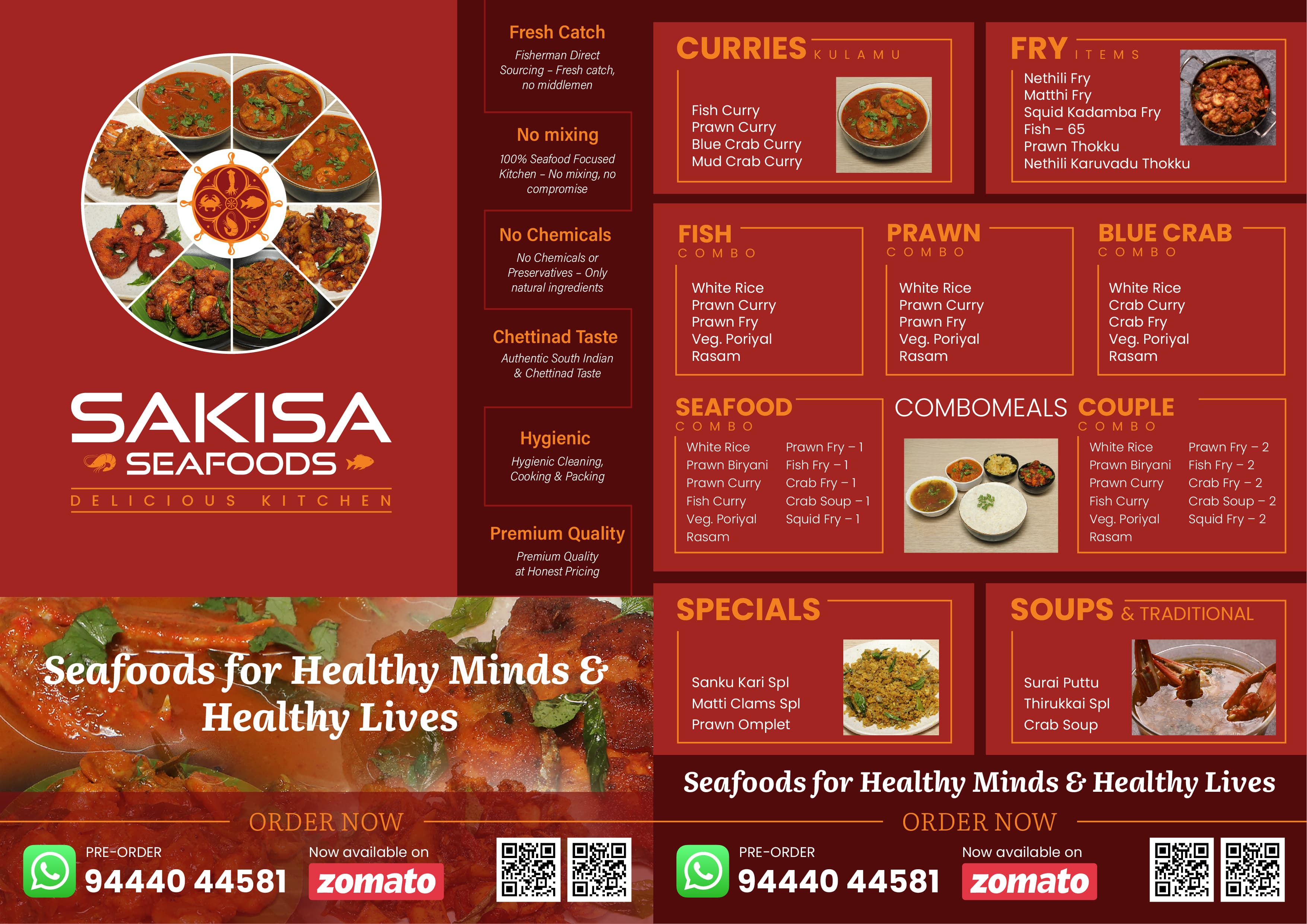
Sakisa Seafoods
I designed the website UX/UI and implemented it on Google Sites, then created supporting marketing materials—a menu card and promotional flyer—all sharing a cohesive visual language.
Role: Brand & Digital Experience Designer
I designed the visual identity for Nagendran Yoga International and applied the visual direction across promotional, print, and digital touchpoints.
Role
Brand & Visual Design
Type
Brand Identity / Visual Communication
Project
Yoga Center
Role
Brand & Visual Design
Type
Brand Identity / Visual Communication
Status
completed
01 —
Nagendran Yoga International is a classical yoga center offering classes, courses, and teacher training programs. The center needed a visual identity and complete brand application across print, social media, promotional communication, and digital presence. Working directly with the center, I designed the logo, visual direction, and applied the identity across all marketing and communication touchpoints to create a cohesive, recognizable brand.
02 —
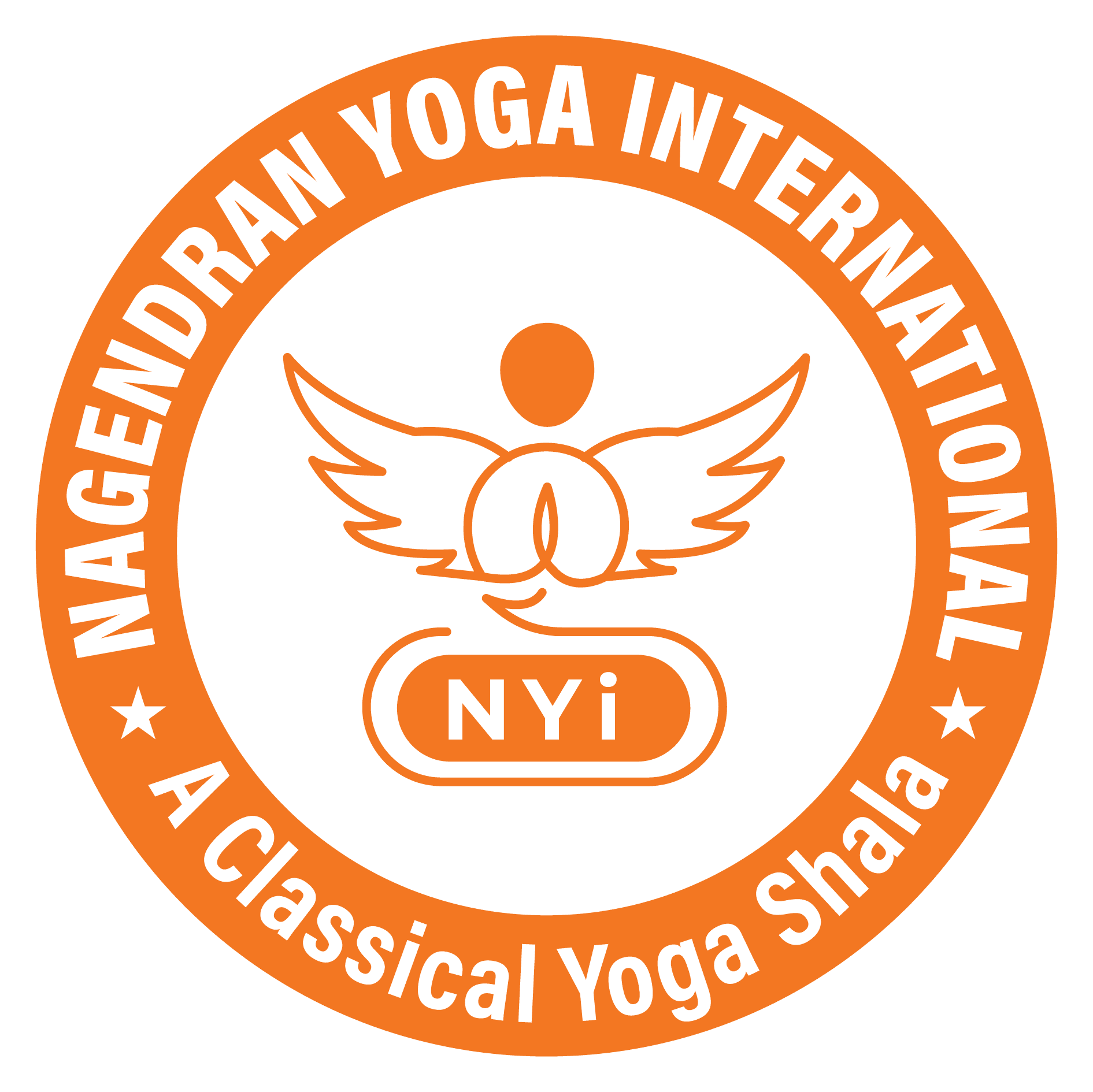
The NYi symbol combines three visual ideas: a yoga figure in meditation pose, wings extending on both sides, and a sun above. Together, these elements represent the core philosophy: the practice of yoga (the figure), spiritual elevation and growth (the wings), and energy and enlightenment (the sun). The symbol is anchored by 'NYi'—an abbreviation clear to the center's community.

A circular badge format featuring the same symbol with the full organizational name around the perimeter, designed for certificates, credentials, and formal applications. The logo works in two primary versions, allowing flexibility across different contexts while maintaining consistent recognition.
03 —
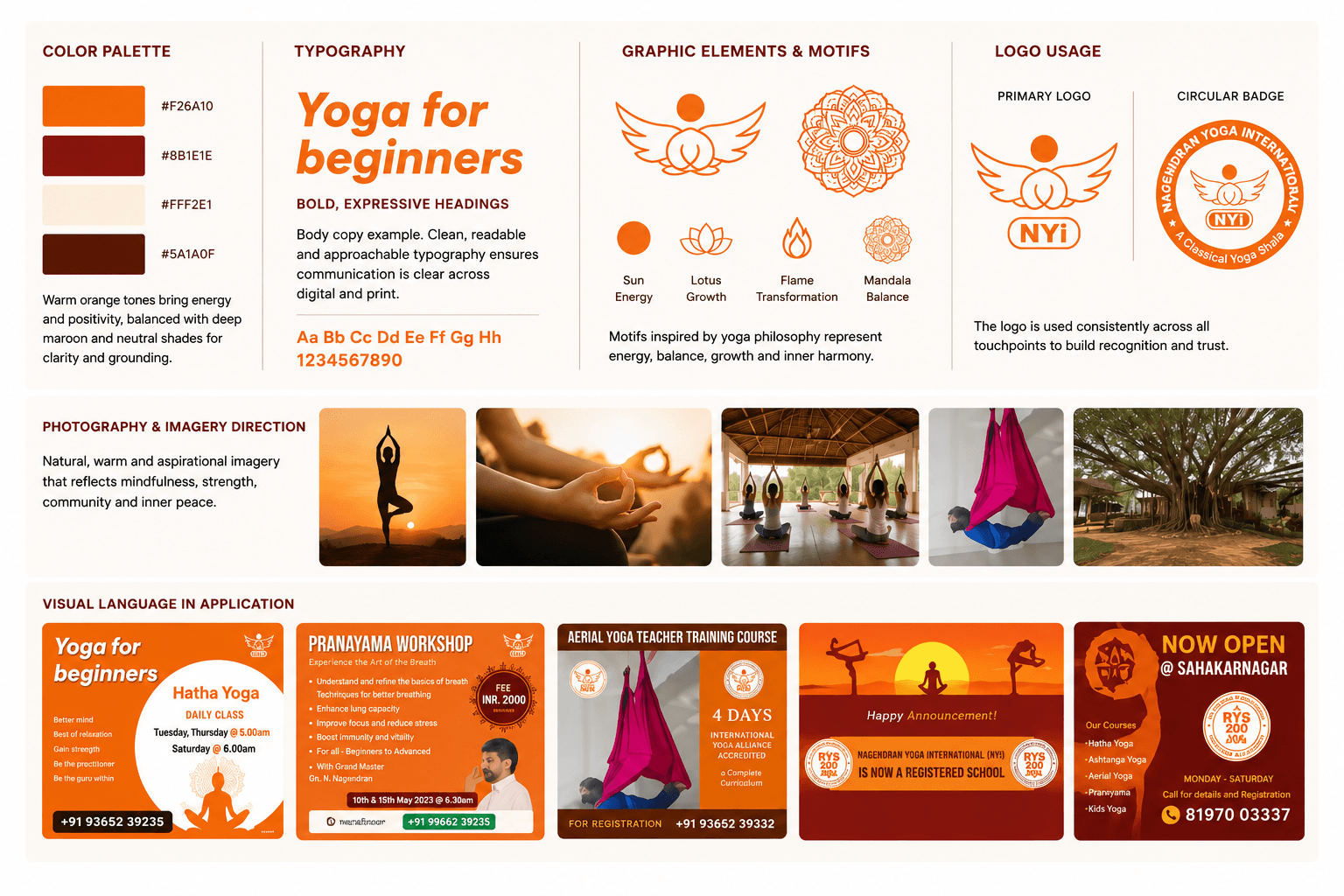
Beyond the logo, the visual language is built from a tight palette of recurring elements. Orange serves as the dominant color, creating immediate energy and warmth across every touchpoint. A complementary maroon appears for depth and formal contexts. Typography is bold and clean, supporting clear communication across social media, print, and web. The graphic language draws from yoga imagery: meditation silhouettes, mandala patterns (representing inner peace and spirituality), sun and circular motifs, and decorative borders. Photography emphasizes practice, instructors, and outdoor natural settings. Together, these elements create a visual system recognizable even when individual applications vary significantly in layout or purpose.
04 —
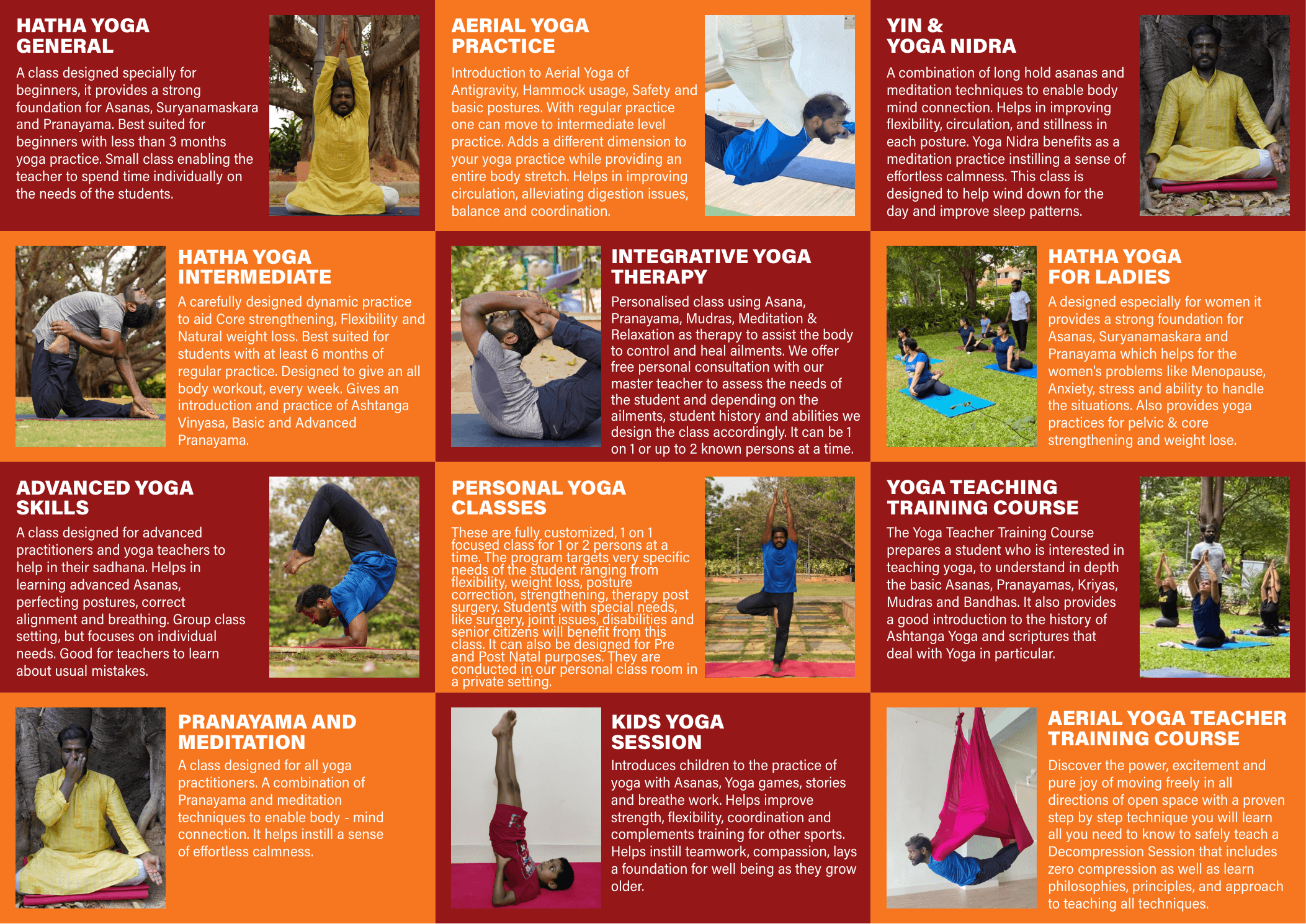
The same visual language was applied to different communication formats without forcing every design into one template. Course promotions highlighted yoga practice and learning outcomes. Announcements celebrated milestones and openings. Educational graphics built credibility and trust. Each format required different information hierarchy, imagery approach, and spatial treatment—but all maintained the visual identity.

Rather than constraints, the variety of formats demonstrated the flexibility and strength of the system. The identity worked equally well as a minimalist social media post and as a dense information design with detailed course curriculum.

Some promotional materials emphasized strong photography while maintaining visual identity through color palette and logo placement.

Celebration of achievements like certification registration and major milestones used illustrated scenes and celebratory messaging.

05 —
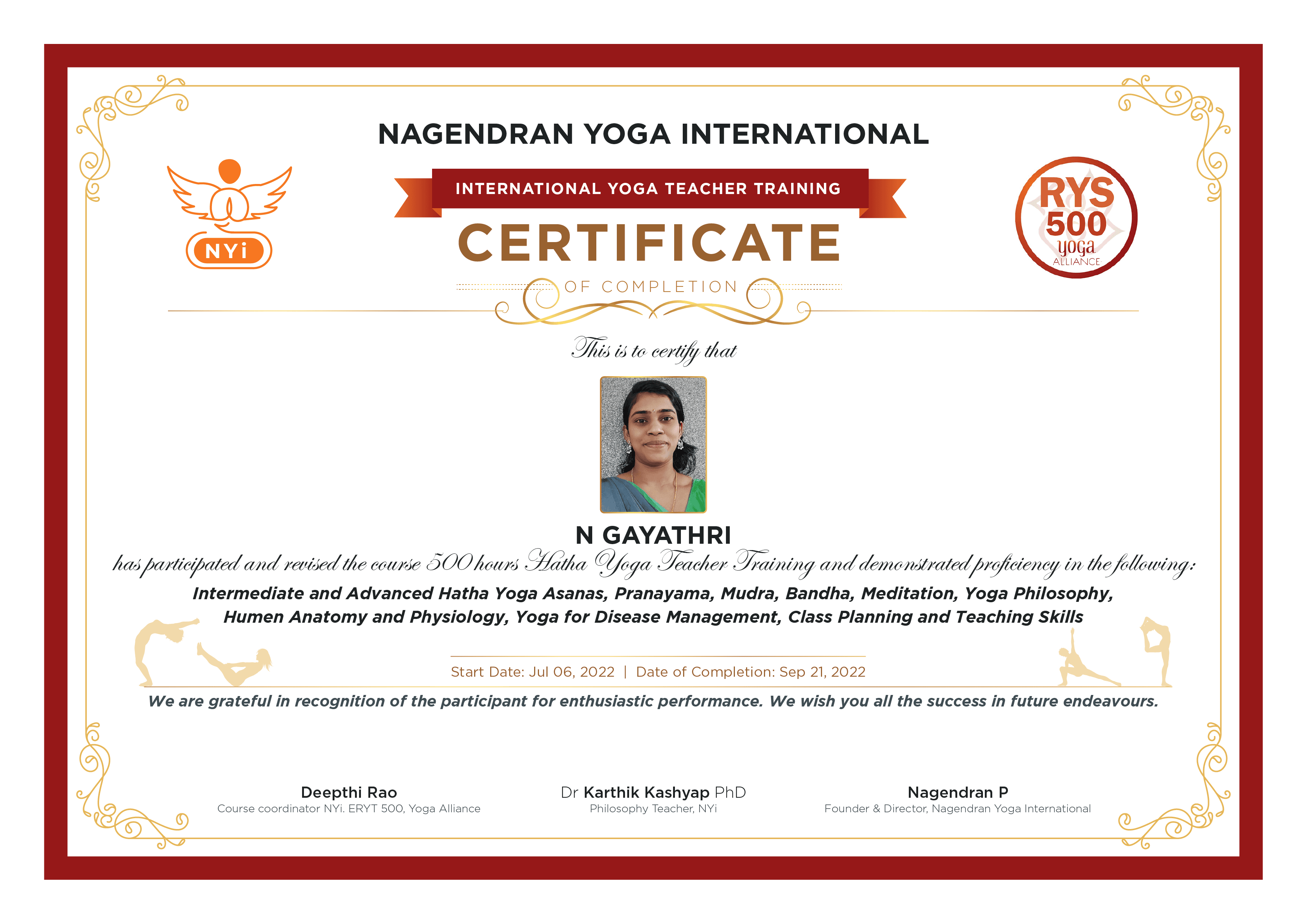
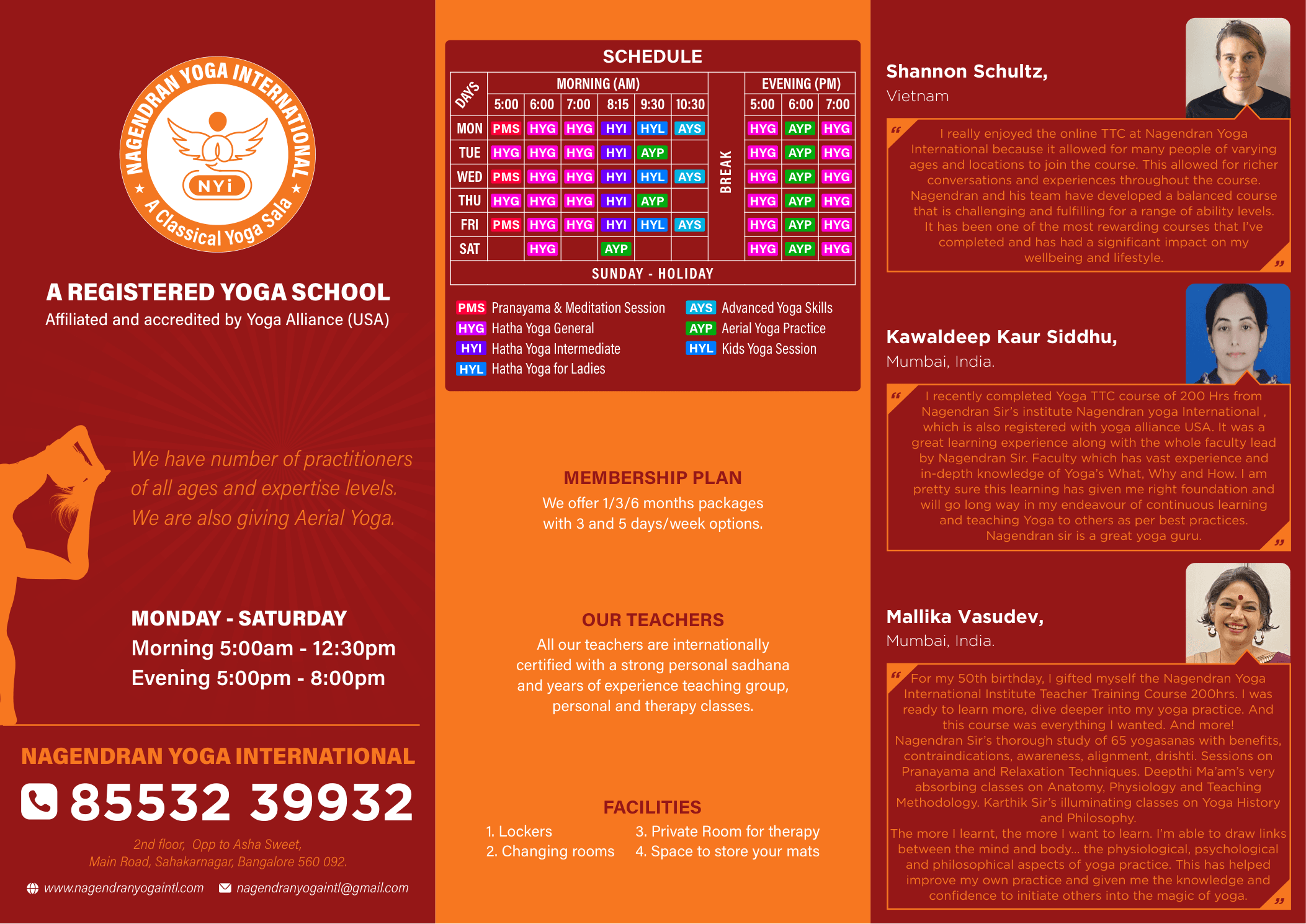
The visual identity extended beyond digital to print materials. Certificates used the maroon secondary color to convey formality and permanence, anchoring the identity in official contexts.
Multi-page promotional material extending the visual identity across course information, schedules and supporting content.
06 —
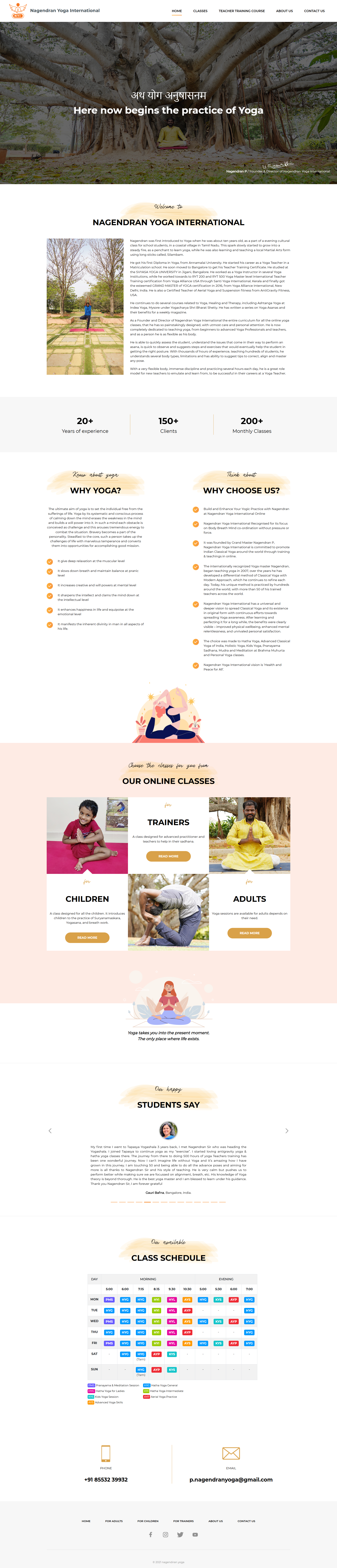
The website served as the most comprehensive application of the visual identity. The design integrated the logo, color system, typography, photography, and graphic language across multiple sections: hero (establishing calm through nature imagery), about, class information (emphasizing variety with photography), trainer profiles, testimonials, and scheduling (color-coded calendar for clarity). The website needed to balance marketing (why choose NYi?) with practical information (what classes are available, when, what does it cost). The visual system provided both cohesion and flexibility—each section could emphasize different content while maintaining immediate brand recognition.
07 —
From a single symbol emerged an entire visual ecosystem. Logo, social media promotions, printed materials, certificates, and website all spoke with one voice while serving different purposes. The consistency was not rigid—it was intentional, allowing each application to solve its specific communication challenge while remaining immediately recognizable as part of the same brand. Social announcements celebrated milestones using illustrated scenes and celebratory messaging. Promotional posters combined the orange primary color with full course listings and strong visual hierarchy. The website integrated all visual elements across hero, classes, testimonials, and scheduling into a cohesive digital experience. This balance between unity and flexibility is the strength of the identity system.
08 —
Working across multiple formats—social media, print, digital—taught me how visual identity systems need both clarity and flexibility. The core symbol and color palette provided the guardrails, but each application required problem-solving specific to its format and purpose. A social media post needed to catch attention in a crowded feed. A certificate needed to convey credibility and permanence. A website needed to balance marketing with practical information. The same identity language worked across all of these because it was strong enough to remain recognizable, yet flexible enough to adapt.
If I were approaching this project today, I would establish the usage guidelines and spatial rules for the identity even more explicitly at the outset. Creating a more detailed brand system document would make scaling to new applications easier, and would help anyone future-extending the identity maintain the same intentionality.
The work also reinforced how important consistency is in building brand trust. Every material, from a small social post to a large poster, contributed to a cohesive impression. The visual identity became synonymous with the center's values and positioning.
Next Case Study
I designed the website UX/UI and implemented it on Google Sites, then created supporting marketing materials—a menu card and promotional flyer—all sharing a cohesive visual language.
I designed the website UX/UI and implemented it on Google Sites, then created supporting marketing materials—a menu card and promotional flyer—all sharing a cohesive visual language.
Role: Brand & Digital Experience Designer
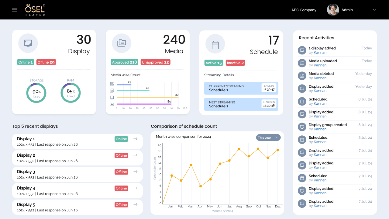
A signage management experience designed to help users create, manage and control digital signage content across displays.
Role: UX/UI Design
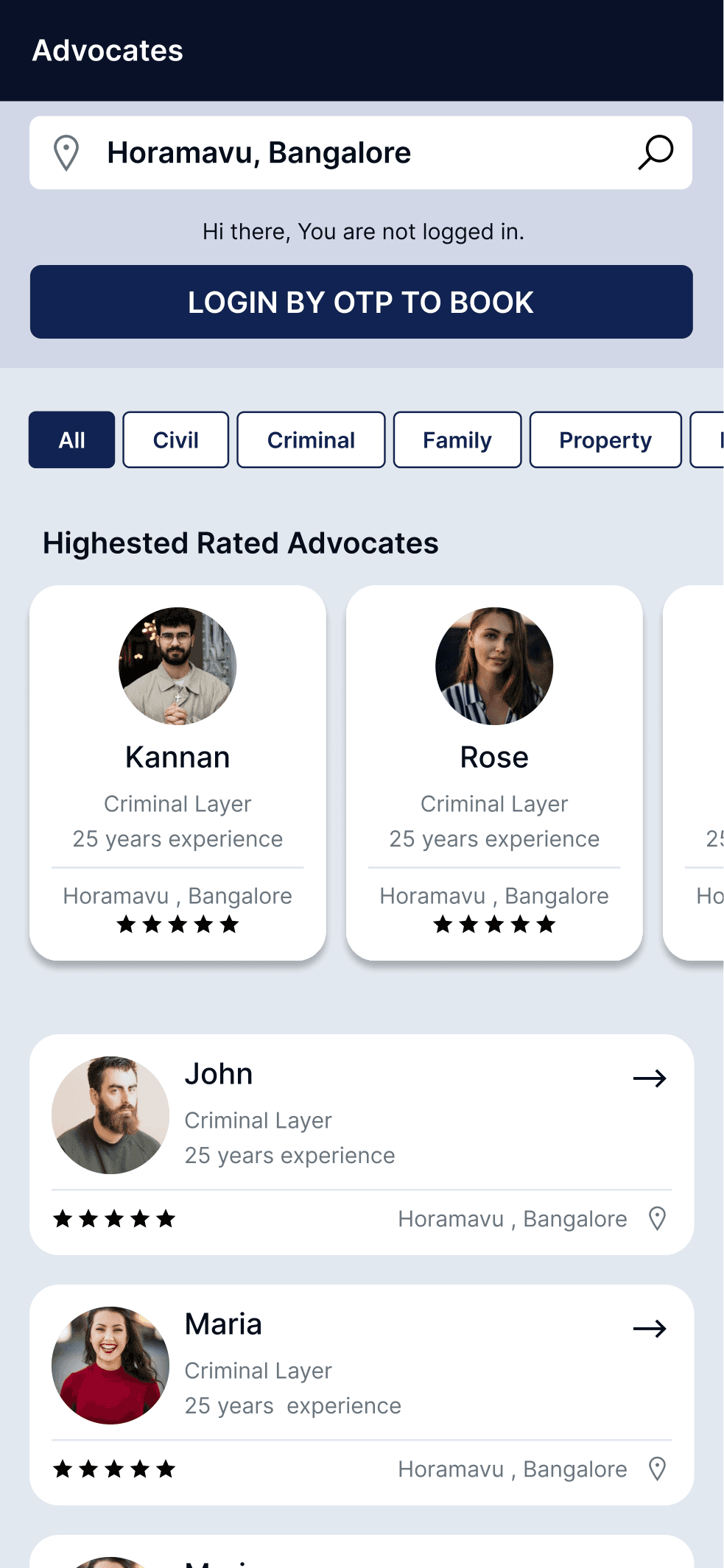
A two-sided consultation platform connecting clients seeking legal advice with available advocates through integrated booking and case management workflows.
Role: UX/UI Design
Let's discuss your project, role or collaboration opportunity.